Wednesday, December 24, 2014

End of year wishes


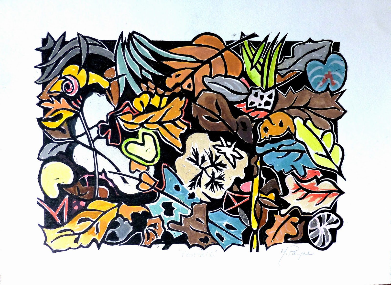
In France, we don't send Christmas cards but instead we send good wishes for the beginning of each new year: "Meilleur Voeux"  So my attempt at celebrating both Christmas and the beginning of a new year took the form of this linocut that I dashed off the last day before my printmaking class ended for the holidays.    

 I don't always have access to a press even in class ( it is regulated differently each week), so I have so far only produced a few of these.... not enough to send one to each of my friends.   

It actually looks better with some paper around it so it isn't really a card, either.  And what is one going to do with a seasonal art work that is too big as a card but not quite right on the wall all year either?  It's an oddity that only a few will want, I imagine.   

But in the blog I can offer it to you with wishes for a thrilling start to a new year.   I hope your year is full of freshness, things that challenge you in a good way..... and so make you happy. 


Monday, October 6, 2014

Still life

 I was thinking about what my friend G said yesterday about my post.  It's true that my beginning paintings could be considered "still lives"..... a still life being a drawing or painting of an arrangement of objects.

I am still working on this one, it isn't as bright as this photo , I need to re-work the background color.  I am not sure I like it.

  I have always been fascinated by the arrangement of objects.  There are so many combinations and textures to play with.  And aside from flowers or fruit that ripens or fades,  you can leave the objects in place for a long time to come back to during the week.  As long as you don't have a cat, that is.   My methodical side likes this idea of painting one subject over many days.


   In French "still life" painting is known as "nature morte" or literally: "dead nature".
Since still life paintings traditionally were done of fruit , flowers, shells, and rocks...I suppose the name came from the fact that all of these elements …..well,  were not alive.   Or maybe the French name had to do with the myriad paintings with dead game in them that were popular in the Flemish baroque period. 

Kimberly Witham,  the taxidermist/artist came up with images of "road kill" along with fruit and fancy plates etc …. no different in content really from Flemish art depicting freshly killed rabbits, lobsters, or wild ducks lying stretched out with tankards, fruit and flowers.  
Take a look at Kimberly's imaginative work.   
 http://kimberlywitham.com/kimberly_witham/Kimberly_Witham.
html


    As for my own attempts of "still life" over the years…they vary from traditional to abstract. The paintings below all count as "still lives".   Maybe I will get back to this genre one of these days.  


This one is almost an abstract.  Painted on raw canvas treated with rabbit skin glue. 

Can't seem to crop this one.  This is in a collection in Seattle.

Sold

Two tone, two plate lino cut print


I used all my dishes whose shapes I liked and made them into a unified color range for this stylized still life. 

Knife painting took about 10 minutes to paint

This one is a nod to  Cezanne


Sunday, October 5, 2014

First attempts at painting


When I first started doing my own art   (instead of reproductions), I was very unsure of what that would be and whether I would be able to deliver what was on my mind.   

 I have always been drawn to intimate interior scenes and still life.  So some of my first paintings were of interiors in watercolors.   

This and the little painting to follow are of a corner of my living room in Nice.  At least the balustrade is really there but the pieces of furniture were actually a table and a book shelf in the corner.  I changed the table into a desk in the first drawing and then a blue table in the second.    I imagined the bouquet, the book, the drawers etc. 

After all one can paint whatever one wants whether it's there are not.  In fact an artist has to edit..... to get a good composition.  And therein lies the first creative step.

 At the time of this painting, I was reading a book by Natalie Goldberg the author of the writer's manual called Writing Down the Bones.    Being a fan, I had bought her book called In Living Color as well. 

 Even though Goldberg didn't think of herself as an artist at the time, she started on a trip with a pen and watercolors.  In Living Color  she shows some fanciful illustrations of places she has lived and scenes from her travels .  Her naive style is an authentic voice and I am sure my second painting was influenced by her expressive images and quirky style.


Natalie Goldberg paintings


After I did the first composition, I started to breathe easier.   This was freedom and whatever I painted was going to be a surprise.   

   So for the next picture of the same corner,   I realized, hey.... I want a blue table and a window and balustrade that are acting out and dancing away.  Why not?  


Monday, September 15, 2014

Mioko Iyhara


Pictures: Miyoko Ihara / Rex Features from the Telegraph


Nine years ago, Japanese photographer Miyoko Ihara began taking pictures of the kinship between her grandmother and her unusual-eyed white cat. 


 Miyoko's grandma Misao found the abandoned cat as a kitten in a shed on her property and the pair have rarely been apart since.


"Misao named the white cat "Fukumaru" in hope the "God of fuku (good fortune)  would come and everything would come "full circle"  (as maru :circle)".


Fukumaru is always at Misao's side whether she is farming her land, having a bath, eating or sleeping.

 Now nearly a decade later their closeness and adventures have been published by Miyoko in a photography book called  Misao the Big Mama and Fukumaru the Cat.  


The couple have become increasingly popular in Japan with this unusual photo essay becoming a bestseller and becoming a viral sensation across the world. 

  All these pictures tell a lovely tale of friendship that not many of us can resist.      

Sunday, September 14, 2014

Shadow of a Doubt

oil on canvas, 60x73 cm, Mary Payne

If you hold the screen so that the colors are the least saturated you will get a pretty good idea of this painting which is one of three of the same size and color range.   I call this one " Shadow of a Doubt" .


Alone/Surrounded


Oil on Canvas, 60x73cm, Mary Payne

Again, to get the full affect of this painting you need to hold the screen so the colors are palest.   I have titled this painting : "Alone/Surrounded".  

Saturday, September 13, 2014

Castles in the Air

Oil on Canvas, 60x73cm , Mary Payne


This is the third canvas of a series of the same size and color range.  I call it "Castles in the air"  after the saying by Henry David Thoreau.

I will paraphrase his words for you:  "so you've built your castles in the air, now put foundations under them."  My mother used to quote this and it has stuck with me.


Kabuki : sketch of the day


 Now that I am out of the cast and into my life again,  I want to pick up one of the treads of my life:  the studio.   I found this photo in my archive of paintings . It is a piece I did from a photograph I found in the newspaper.

 It is done with oils using mainly a palate knife on oil paper.   I still like it.


Sunday, May 4, 2014

The Blue Tree: Monotype


I don' have many examples of monotype in my experience but I would like to change that.    Monotypes are made by drawing on glass in acrylics (or your preferred medium) and then pressing a paper on top of it to make a print.   You can draw with a tool of any kind, or you can wipe away paint with a rag to get the effect you want.  

This little piece was bought by a couple of friends, Philippe and Jacqueline, and now hangs in their guest bedroom.   I visit it sometimes.  


Saturday, April 26, 2014

Sketches from the notebook

I still believe in learning how to draw….although there are art schools nowadays that don't teach it.  

Everybody who wants to understand how to give volume to an image, or depict the human body in two or three dimensions ( you can use clay) should try "life class"as a brain exercise. 

  Some days you come away satisfied with your output and sometimes you don't .  It is the same as any other discipline, really.  The important thing is that one keeps at it.  

Well, I should take my own advice and get back to "life class".  These are drawings from my "stash". 


The Two Girlfriends: Tamara de Lempicka


This is a copy that I did while living in Italy.  It was a small painting by Tamara Lempicka.  The original painting is 20x30 cm but I copied it to measure 60x115 cm.  I felt it could really use the size and I can't imagine enjoying it as much in the small proportions. 


 I found an image of the original painting on the blog:  Conchiglia di venere http://conchigliadivenere.wordpress.com/category/lempicka-tamara-de/

Oil on Canvas, 20x30, Tamara de Lempika


There is something really clever about this painting.  Notice the knee and the foot position on the nude facing us.  It is an optical illusion that the hip would be this high. Try to bend your foot like that foot depicted. It is foreshortened and at an odd angle.    Certainly Lempicka, a master ( mistress?) of composition,  did this to give drama to the painting.  

   I lightened up the painting and changed the hues slightly.   I hope Lempika would have approved my messing with her ingenuity. 

Wednesday, April 23, 2014

Pastels


I have never been a big fan of using dry pastels by themselves as I have never known how to keep the resulting work from fading,   or smearing ; or even how to safely frame a pastel after it is fixed.

  Commercial fixatives dull the colors of a pastel and the Dega method of water spray has never worked for me either.  

 One does notice that the best pastels by the masters are always kept in a darkened room when being exposed in a museum, so another worry for the artist is will the piece fade if you sell it?

I have a big set of colors in dry pastels (pastels secs) and use them mostly only in mixed media pieces. They are also a way of coloring a lino print after it is printed. 

 Here is perhaps the only trio of pieces in my archive that I have done in pastels only.   I still "kinda" like these.   And now I think, "so what" if they fade.  We are all fading one way or another.  That is the way of things.  Non?


28x45 cm.  Pastel on paper


Sunday, April 13, 2014

"Footfall" photos

Continuing on from my last post I thought I would contemplate some more of my "footfall"  photo series  with another print in mind.  Most of these were taken last October when I visited South Carolina. 

Seattle curb side


Charleston, S.C.


Charleston, S.C.


Magnolia Gardens, S.C.


Fort Fremont, S.C.


Hunting Island, S.C.


Magnolia Gardens, S.C.


Mount Pleasant: Charleston, S.C.


Mount Pleasant: Charleston,  S. C.


Old pavement made of ballast stones, Savannah, Georgia


Wadmalaw Island, S.C.

Footfall : linocut


Ok, so I have been slacking off on my blog lately but that doesn't mean that I haven't been in my studio.  It just means that the process of art got more interesting than the reporting of it. 

 And besides the studio was getting out of hand and I had to do a big clean-out. 

But I have a new series to show you.  I call this one "footfall".   It just means that I took a look at where my"foot fell" and realized how interesting the different elements were there and of course, like any illustrator I added and subtracted as I drew.    I have a whole series of footfall photos now. 


 Here is the original photo that was a shot taken in Sweden years ago. I really can't remember if it is my photo or Aksel's.  Aksel and Hanne were the Danish couple I was privileged to live with during my " junior year abroad" program at university. 


 And here is the reverse drawing that I did of the images so that when it was used as a print it would be printed in the sense of  the top photo.


And here is the carved "lino plaque" after many prints have been pulled. 


detail of lino block

And below is the result having rolled it out with black ink on BFK Rives paper. 


Now starts the fun part:  I conceived this print to be hand painted with water colors. 

  Here is what I came up with.  At the last minute I decided that I like the print as a vertical too so I signed some of them like that.